
Hello and welcome to the new Mademoiselle Cranky Pants blog!
...Well, not all new, just the banner part ;) hehehehe oh and some of the things on the side bar, too! Do you like our new look?
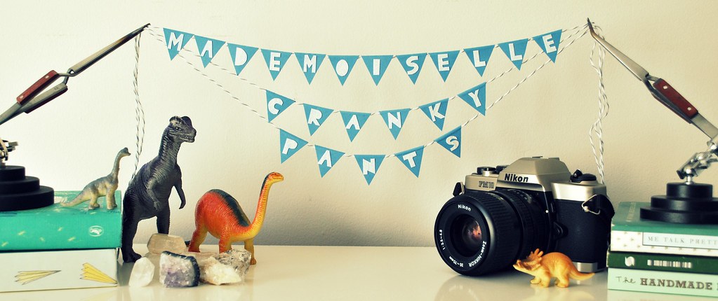
I wanted it to represent some of the things I enjoy and talk about on the blog: The dinosaur toys are of course representing Amelia :) not that she has anything in common with a wild, extincted animal (lol), but she loves dinosaurs so much and I wanted to have one of her favorite toys here (and one that fitted my screen!).
The books are, well, representing just me, the things I like and I'm interested on (like illustration, children stories, creating a small business, and literature in general).
The bunting well, I just love buntings and paper stuff.
The things that are holding the bunting are a jewelry making accessory called third arms and I used them when I'm soldering my jewelry, so they represent my jewelry.
The minerals might represent my love for nature and also represent a bit of the jewelry thing, I guess.
The camera is because I love photography.
I think just Alex is missing :( but he's the most important thing of all so he'll be represented by my whole blog, because he's the pillar of it all, like the sunshine that lits everything around me :) so please don't feel excluded baby ;)
And speaking of Alex, he was the one to put the new blog look together as I'm such a dope for html :S Thanks cori!
Oh!! and my friend Alty helped me, too, with the fonts and speech bubbles! she did such a wonderful job :) thanks Champs!!!
And that's the inspiration and concept behind my new banner :) I hope you enjoy a bit more to come here and look around! For sure my eyes are super happy with all the changes, not that I did not like my old look but changes are always good. And this is particularly lovely :)
Thanks for visiting and Have a great week!
Iveth




this is very cute! i love the animals and the bunting ^^
ReplyDeleteluce chisísimo, me encanta todo! el concepto, los botones de los lados y la explicación!!
ReplyDeletebuen trabajo!
The banner is sublime - I love the bang of creativity & sense of fun it shouts out to us, your readers. Lovely!
ReplyDeleteAnd the dinosaurs are so smile-worthy!
WoW! Perfection!!!
ReplyDeleteMe encantaaaa!!! ♥
ReplyDeleteBesos grandes
I absolutely LOVE IT!!! It is soooo very cool Iveth! :)
ReplyDeleteCool banner!
ReplyDeleteWow I so LOVE this! Love the banner and the side bar buttons and love to know the story behind them!
ReplyDeleteYour new blog banner is amazing..I'm inspired!
ReplyDeleteNot only is your blog name hilarious and your banner absolutely cute, but your blog is just chocca block with inspirational imagery! Lovely discovery! :-)
ReplyDeleteAwww thank you all!! I'm so happy to read all you comments and to know you are enjoying the new banner!! Thank you so, so much for your constant support and love!
ReplyDeleteIt was so much fun to put this new look together, to make the bunting and set up the props. The best part was photo shooting the dinosaurs and animals for the side bar :) hehehe I know why Amelia loves to play with them so much ;)
Your new banner looks fantastic! And I love the figurines in the side bar!
ReplyDeleteThanks Laura!!! :D
ReplyDeleteSuper !!! a mi también me gustó mucho :D
ReplyDeleteYay!!! muchas gracias tambien por tu ayuda Alty, te quiero!!!
ReplyDeleteSO COOL!!! IT's awesome, Iveth!! you are awesome!
ReplyDeleteThis new banner is amazing!! I love it! All the elements work so well together and represent a different part of you :) It is perfect!
ReplyDeleteME PARECE SUPER ORIGINAL!!!!!!!!!!!!!!!!!! que lidno quedóoooooooo!!!!!
ReplyDeleteuy se siente como estar en otro lugar! extrañaré a la niña que tenias con sombrilla no? (era muy linda) pero este esta increible! felicidades a todos los que te ayudaron.... :)
So clever and creative! I love it! It is so intriguing and as a first-time visitor, it makes me want to learn more about you!
ReplyDeletei noticed your blog was different-- it looks so great! especially those external links in the side bar. really impressed and it's a great 'identity' for you, without looking corporate!
ReplyDeleteYour blog looks amazing!! I came to your blog via Etsy's featured seller article (before even finishing reading the article). I "studied" your blog's homepage and though it was so inspiring.. .so it was a coincidence that I stumbled on this particular post and can comment and say, "Yes, I like your new look!" and read what inspired you for your look. Love it!
ReplyDeleteAll the best! ~c